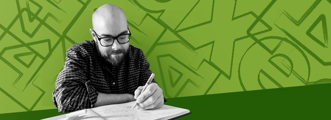
Jakob Petersen, what did you consider when creating our new axes4-logo?

Jakob designed our new axes4 logo. Today, he showcases us the process and his ideas behind it. Which thoughts did he have? Which challenges did he have to overcome? And how did he integrate the aspect of accessibility?
Which thoughts or ideas are behind the new logo?
When designing the new axes4 logo I had to take various considerations into account:
- Is it a redesign of an old logo or a completely new logo with a new style? What values should the logo convey?
- How does the new logo fit into existing materials such as websites, software, print material etc.?
- How do I ensure longevity of the logo in a evolving media landscape?
- What level of accessibility must the logo meet?
graphic designer at axes4.A media design education should first and foremost be a study on how to communicate information clearly and efficiently in a way that includes people rather than just make design look cool.
What were the difficulties creating the new logo?
I started by looking at the old logo to analyze its strenghts and weaknesses. It was clear that one of axes4's strenghts is the green corporate color that is easily recognizable with a high brand value. This convinced me that the logo should be redesigned rather than designing a completely new logo.
In the new logo I also keep the logotype, the letters "axes" to maintain recognition and focused on redesigning the logo symbol.
The old logo symbol had a stylized outline of a document icon and a circle with the number 4 in the middle that “brakes” the circle symbolizing that axes4 breaks the boundaries of what was previously not accessible. One of the weaknesses of the old logo was that all these elements make the logo hard to decode, especially in small sizes, so I had to find a way to simplify the form without taking away the symbolism. My solution was to place the number 4 inside the stylized document symbol and “break” the borders of the symbol with the number.
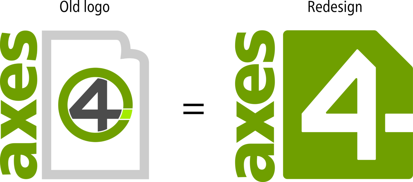
Removing the greys and light green colors has several advantages, the first being that the colors didn’t meet the WCAG standards, since the contrast wasn't enough. Low contrast makes a logo difficult to see in small sizes, so high contrast is not only a design choice that caters to the visually impaired, but to everyone who sees the logo. The other advantage of choosing just one green color plus white is that the logo can be placed in a light version on a dark background and a dark version on a light background, which was previously not possible with the old logo.
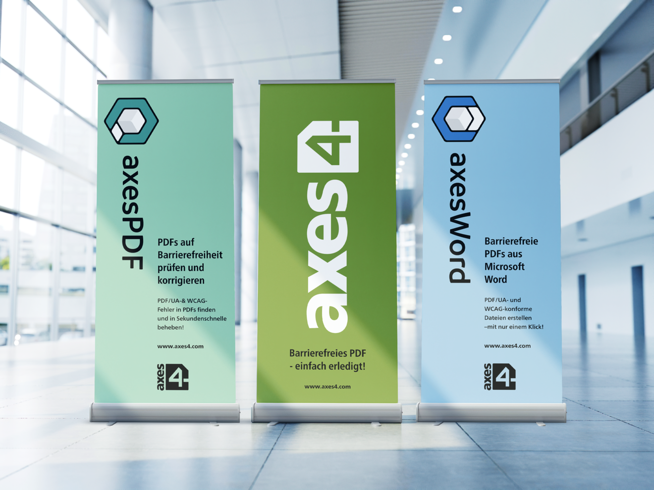
As seen on the middle advertising banner in the image, I also designed an alternative logo that works better in a horizontal format, this logo is especially practical on media where space is limited such as on websites and other digital application or print media such as business cards.
Was accessibility a big part of your studies or did you only encounter this topic after your academic degree?
I have a bachelor's degree in graphic design from the Danish college of visual communication where i graduated in 2004. At that time, I had more classes where I was taught calligraphy than web design, so accessibility was in no way part of the curriculum, which is paradoxical when you consider that my fellow students that studied industrial design, had courses focusing on physical accessibility. In my opinion a media design education should first and foremost be a study on how to communicate information clearly and efficiently in a way that includes people rather than just make design look cool.
After I graduated, I worked at an Ad agency that specialized in print design. At that time a lot could go wrong when exporting design to PDF-files so out of necessity, correctly exporting PDFs became a specialty of mine. A couple of years later I started a freelance company that focused on layout of report for the Danish state and municipalities. One of my clients was The Danish agency for digital government and they require that the PDF-files were accessible. Not having any formal training in that field, I had to figure out how to do that, but with help of an accessibility expert from the Danish agency for digital government I got the hang of the fundamentals and started focusing on accessibility as a business niche.
In 2016, the EU adopted the Web Accessibility Directive and in 2018, the Web Accessibility Act implemented the directive into Danish law. This created both a market for remediating PDF-files, but also a need for education about accessibility. So I started a company with Asbjørn Fangel-Hansen, the expert from the Danish agency for digital government that had previously helped me with accessibility fundamentals. Our company core product was remediating PDF-files, but we also consulted on accessible design, and I taught seminars about accessible PDF-files from InDesign.
At the seminars, I met graphic design colleges who had recently graduated but had no- or limited knowledge of accessibility. In my opinion, it is counterintuitive to implement a law for the purpose of making information accessible without also making the tools and education that are essential for producing this material accessible as well.
